
Increased App Store rating
New App Store rating
Finding your games quickly
An easy and intuitive way to let players find the games they play over and over.

Visually appealing
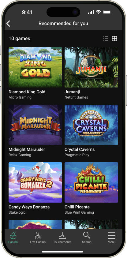
Giving the option to see the games in a visual grid view.
Digging into the details
Giving the option to switch to a list view to see more game information.

Design Process.
Our guide throughout the project.

A non-linear process
The process is non-linear; that means that we just don't go forward. We do several rounds of design iterations. When we in testing learn new things, we go back and ideate new solutions that we prototype.
Empathize.
Researching our users' needs.
How it all started
To make sure we catered for user needs and built the right thing, we needed to understand our users, how they interact with our current app and which features they use.
By looking at the analytics data from our current app we could draw some valuable conclusions.
Playing for real money
Playing the same games as last time
Searching for games
What does the analytics data tell us?
Finding 1
We need to make it very easy to deposit and withdraw money, since over 88% are playing for real money.
Finding 2
Customers must find the games they played last time quickly, since almost 65% play the same games.
Finding 3
Search doesn't need to be very prominent since it is not frequently used.
Competitor analysis
My team and I did a competitor analysis of direct and indirect competitors to understand the landscape and gather ideas for improving our experience and new features to add.


What does the competitor analysis tell us?
Finding 1
The apps navigate in a very similar way, making customers familiar with certain navigation patterns.
Finding 2
Mixing shapes and sizes of items makes them stand out from the content around them.
Finding 3
Content is often presented in a card layout.
Define.
Stating our users' needs and problems.
Creating personas
In order to help us better understand our users' needs, behaviours, goals and challenges it is essential to define personas for each user segment.
Creating empathy maps
In order to paint a picture of how the users interact with our app we created an empathy map for each persona. This gave us a good indication of what the user segments say, think, do and feel.
The 5 W's
- Who — the user groups represented by our personas.
- What — hard to find the games they are looking for and hard to compare games.
- Where — when navigating within our app.
- When — when looking for a game to play.
- Why — users spend lots of time in the app without finding what they are looking for.
Problem statement
“An existing gambling customer needs to quickly and confidently find the game he wants to play in order to spend less time browsing the app.”
Ideate.
Generate a range of creative ideas.
Brainstorming solutions
With our findings and problem statement in mind, the team brainstormed solutions for the information architecture of the casino lobby and the navigation of the app.
We had learned that navigation is important, so using something familiar was key. Users also tend to play the same games as last session, so we experimented with placing recently played games in a prominent position.
Prototype.
Build real representations of the ideas to get quick feedback.
Wireframes & lo-fi prototype
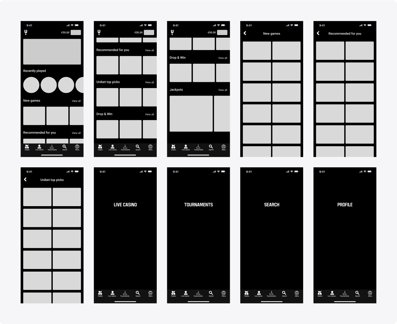
To quickly get feedback on our concept, we created a low-fidelity prototype using wireframes for user testing of the navigation and the recently played section.

Testing.
Collecting feedback from users.
User testing — Iteration 1
The first round was conducted using wireframes on purpose, to get quick feedback before committing too much time. Could customers navigate between sections without friction and find the games from their last session?
Participants
Age
Research questions
- How would you search for a specific game?
- How would you find the Live Casino games?
- Where would you find the games the casino recommends for you?
- Where would you find the games you played last time?
“It's really easy to navigate within the prototype.”
“A really well designed and laid out app that would be a pleasure to navigate around.”
“It is at the very top, and I think this is a really good idea.”
Finding 1
Users had no problem navigating between different sections of the app.
Finding 2
The content was perceived to be structured in a logical way.
Finding 3
It was very easy to find the content they were looking for.
Iterate.
The design process is not linear — we did more than one round of prototyping and testing.

High-fidelity prototype
In the second iteration we built a high-fidelity prototype with real graphics and jackpot filtering to validate design decisions.

User testing — Iteration 2
We validated how we present and structure the games customers are used to playing, using the high-fidelity prototype.
Participants
Age
“I like the navigation. I don't think there's anything I would really improve.”
“Everything looks perfect and organized to me.”
“This is exactly how I would like it to be laid out.”
Find the games they played last time
Find the number of new games
Find the recommended games
Find the Daily Jackpots via the filter
Finding 1
It was easy to find last-played and recommended games.
Finding 2
Easy to find the number of new games.
Finding 3
Not clear where to find the jackpot filters.
Final Designs.
Reflection.
Key takeaways and next steps.
Conclusion
We delivered the app to development in iterations — one component per sprint, with pixel-perfect designs and UI specs in both dark and light mode. This kept UX one sprint ahead of the developers.
The app was built for iOS and Android with two development teams and released across Europe, Australia and the US. Jackpot filters were held back until findability improved.
After launch, the iOS app saw an increase in app rating of +74%, taking the App Store rating from 2.8 to 4.7 across 9 countries.
Next steps
The MVP didn't include the new in-app navigation pattern due to time constraints — that's next. We'll also keep iterating on the jackpot filters.
Learnings
Beyond internal stakeholder requirements, the app is audited by regulators in every market we launch in.
We also had to follow Apple's guidelines closely — some apps have been denied in the past. This time we released without any issues.