
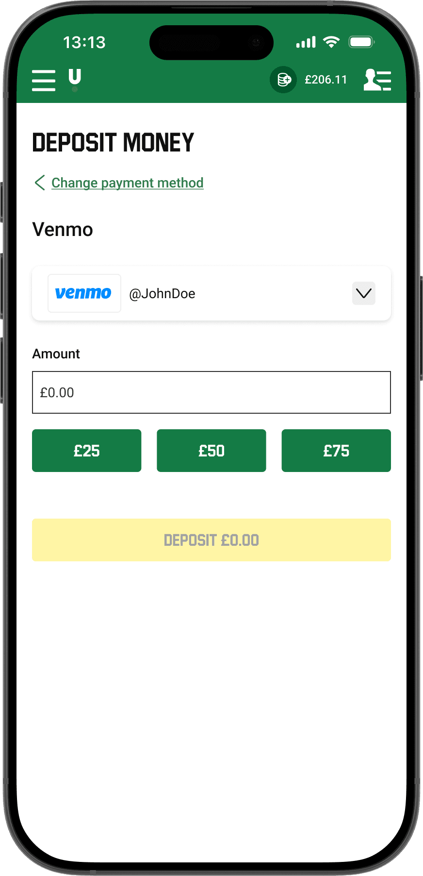
Venmo Deposit
A user-friendly way of completing a deposit.
Venmo Withdrawal
Clear calls to action when making a Venmo withdrawal.

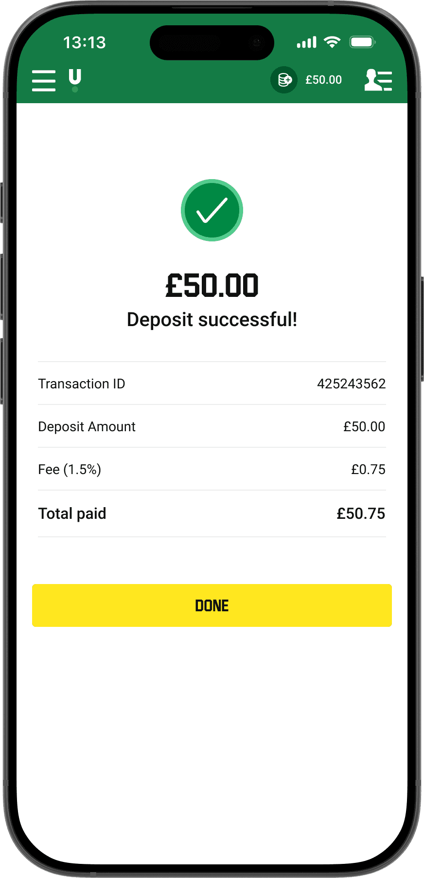
Successful Payment
Giving players clear feedback that the payment request went through.
Payment in progress
Showing payment status in a visual, friendly way to reduce confusion.

Design Process.
Our guide throughout the project.

A non-linear process
The process is non-linear; that means that we just don't go forward. We do several rounds of design iterations. When we in testing learn new things, we go back and ideate new solutions that we prototype.
Empathize.
Researching our users' needs.
Unmoderated interviews
We ran unmoderated interviews to understand how Venmo is perceived among players and what information is important to show.
Participants
Age
Research questions
- When and why do you use Venmo?
- What would be the benefits of using Venmo to deposit or withdraw for gambling?
- What best identifies that the app is connected to your Venmo account — username, name, email or phone number?
- Do you perceive Venmo as secure and trustworthy? Why, why not?
“I use it all the time for peer-to-peer payments and I consider it very secure.”
“I love using Venmo — if a gambling website allowed me to deposit and withdraw with it, I would definitely use it.”
“Your username is unique to you.”
Finding 1
The majority of participants perceive Venmo as trustworthy and reliable.
Finding 2
The most important thing to display is the Venmo username.
Customer contacts
Looking at why customers contact support about payments revealed key pain points.
Of customer contacts relate to withdrawal status
User survey
Since withdrawal status is a pain point, we surveyed 20 participants on which information matters most on a payment receipt.

Find the amount important
Find the withdrawal status important
Find animations important
Find graphics important
Finding 1
Highlight the withdrawal amount very clearly.
Finding 2
Clearly showing withdrawal time and status helps customers find it instead of contacting support.
Finding 3
Animations and graphics weren't expected, so they're left out of the first release.
Define.
Stating our users' needs and problems.
Creating personas
In order to help us better understand our users' needs, behaviours, goals and challenges it is essential to define personas for each user segment.
Creating empathy maps
In order to paint a picture of how the users interact with our app we created an empathy map for each persona. This gave us a good indication of what the user segments say, think, do and feel.
The 5 W's
- Who — the user groups represented by our personas.
- What — hard to keep track of the money when withdrawing.
- When — after customers have withdrawn their money.
- Where — when using a payment method to withdraw.
- Why — customers contact support to learn when they'll be paid. Every contact costs money.
Problem statement
“An existing gambling customer needs to be informed of withdrawal times when completing a Venmo payment.”
Ideate.
Generate a range of creative ideas.
Crazy-8 brainstorming
Most customer contacts are about not knowing the status of their payment, and the receipt must show the withdrawal amount and status — graphics and animations matter less. With that, we sketched receipt concepts.

Prototype.
Build real representations of the ideas to get quick feedback.
Wireframes & lo-fi prototype
The payment page must show the user's Venmo ID; the receipt must clearly show amount, status and payout time. We built wireframes and a low-fidelity prototype of the full flow.


Testing.
Collecting feedback from users.
Participants
Age
Research questions
- How would you make a $25.00 deposit using Venmo?
- Can you make another $50.00 deposit with the same method?
- How would you remove your Venmo details from the site?
“It's very straightforward and very simple.”
“I should be able to just remove an account without having to go through customer support.”
Understood how to remove their Venmo account
Want to remove it without contacting support
Final Designs.


Reflection.
Key takeaways and next steps.
Conclusion
Final designs were handed over with detailed UI specs for colors, fonts and spacing, and regular sessions kept the developers in the loop. That emphasis on communication saved time and avoided misunderstandings.
Alongside Venmo deposits and withdrawals, we delivered new receipts covering both successful and pending payments — using color and a progress bar for state. Both are being released in the United States.
Learnings
Close collaboration with developers saved lots of time through constant feedback.
Proper user research early on is essential — wrong decisions cost time and money to undo later.