The concept.
One everyday task. A focused experience.
Keeping weight tracking simple
Just Weigh centres the experience on a straightforward routine: record a weight, then return to see how it changes over time. The product is presented as a minimal weight log, rather than a broader diet or coaching programme.
The screen hierarchy reflects that focus. The latest measurement is prominent, the trend sits directly beneath it, and adding another entry is available from the bottom of the screen.
The experience.
Log a measurement. See the trend. Review the details.
Today, at a glance
The home screen leads with the latest weight, its unit, and a timestamp. Below it, a progress chart connects individual measurements into a trend, with time ranges and changes shown together.
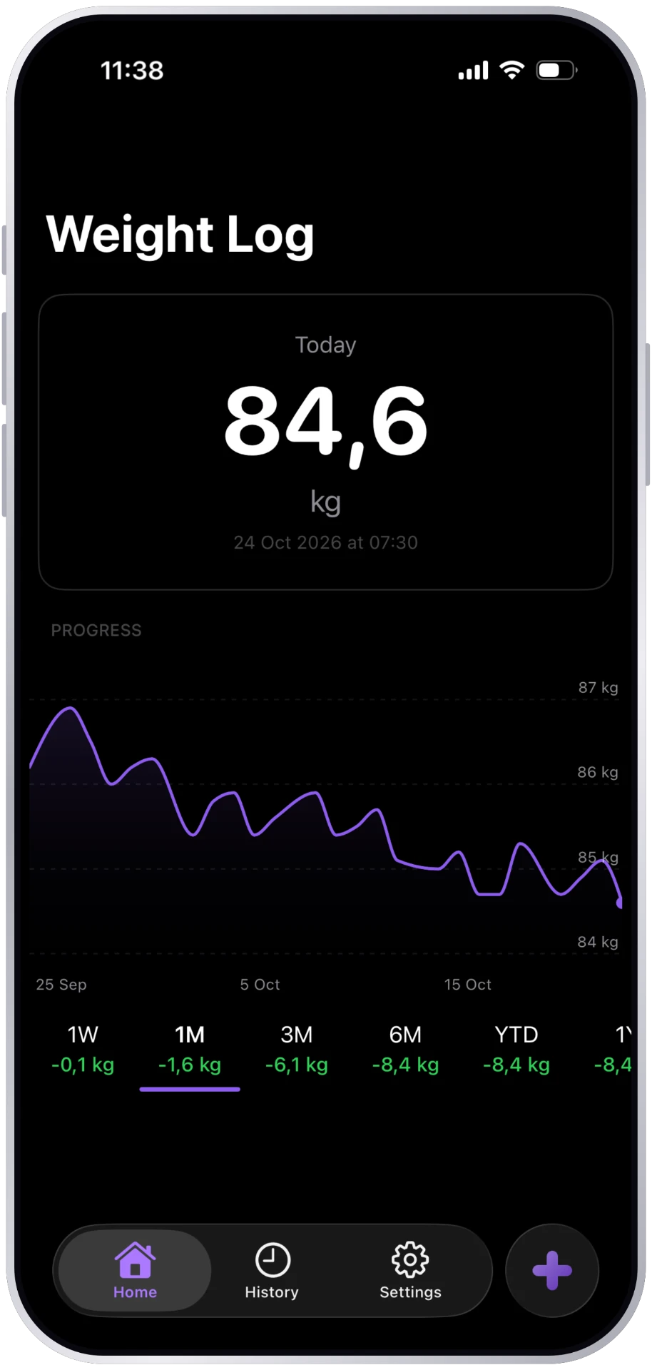
A focused way to log
A bottom sheet keeps weight entry close to the home screen. It combines a date, a large weight value, a ruler-style selector, and an optional note, ending with one clear Save action.
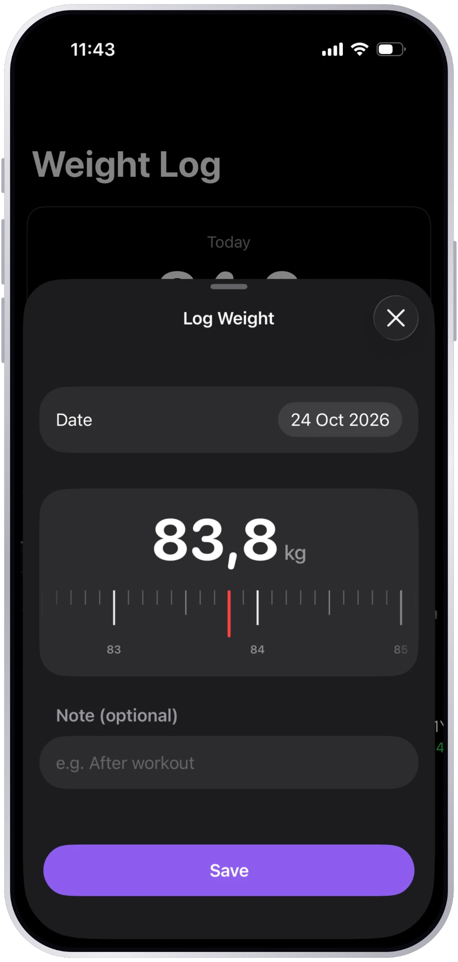
Look beyond a single number
The chart offers multiple time ranges and shows the change for each period. A selected point reveals its weight and date, connecting the broader trend to an individual measurement.
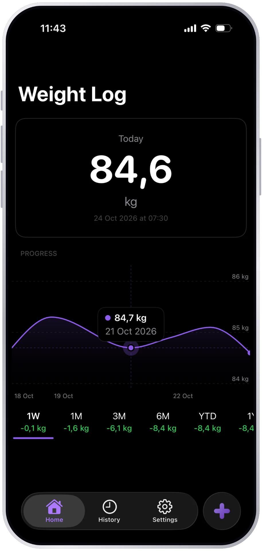
Every entry in context
History groups entries by month. Each row pairs a date and time with a weight and daily difference, making the record scannable without opening every entry.
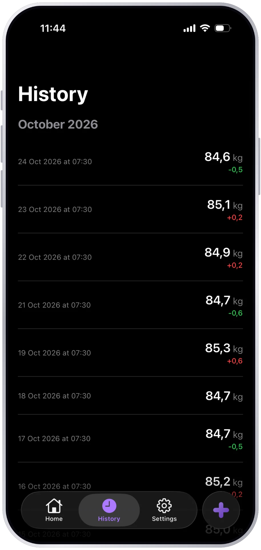
The visual language.
Less noise. More clarity.
A calm, consistent interface
The screenshots use dark surfaces and large, high-contrast measurements. Violet connects the progress chart, selected navigation, and the primary logging action; supporting labels remain visually quieter.
Home, History, and Settings form a consistent bottom navigation. A separate plus action keeps the core task of adding a measurement distinct from moving between screens.
Light and dark, side by side
Just Weigh supports both light and dark appearance, with the home screen, chart, and navigation adapting to the system setting. Drag the handle to reveal more of either side.
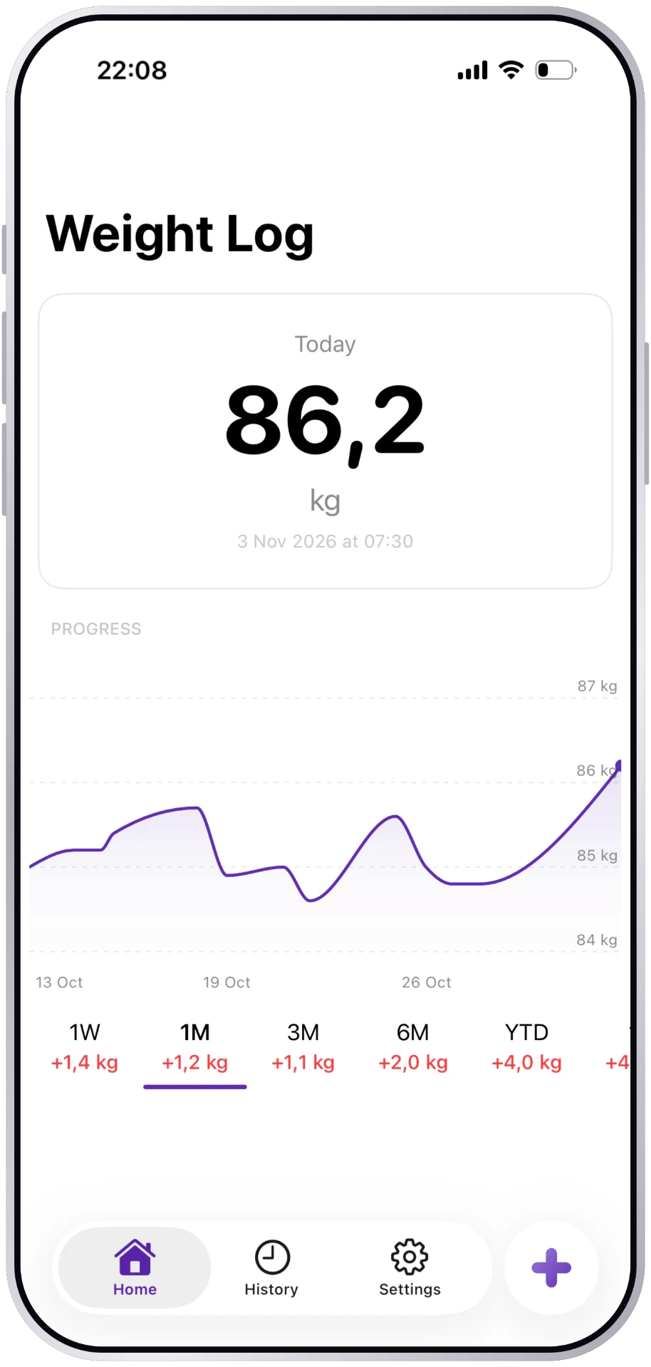
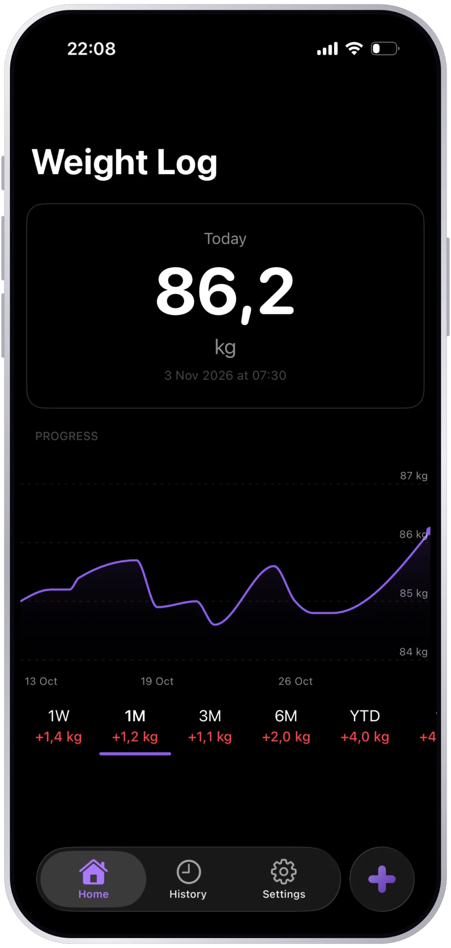 LightDark
A privacy-focused proposition
The app showcase presents Just Weigh as keeping data on the device, without accounts, ads, analytics, or third-party tracking. These are the product’s stated privacy commitments; the showcase alone does not independently verify the app’s storage behaviour.
The project today.
A focused product, made visible
The Just Weigh showcase documents the key app screens and its minimal, privacy-focused positioning. The images in this case study are the original screenshots from that project.
This write-up covers the visible product experience. Research methods, development milestones, user feedback, and measured outcomes are not yet included, and an App Store release has not been verified.